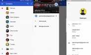
Google has redesigned its Contacts app to version 2.0. The new version brings a cleaner interface and has incorporated the account switcher in a much better way.
Now there’s a slide-out menu with an account switch button like on other Google apps (think Drive or Gmail).
Google Contacts 2.0
The contact page has also seen a redesign. Previously the contact picture took up half of the screen with all of the contact info crammed below – now the picture is a much smaller circle and you get much more at-a-glance.
Finally and quite naturally Contacts 2.0 supports the new Android…